typedef struct rect { int x, y, w, h; uint64_t id; } rect;
rect r_cut_px(r_alignment dir, rect* to_cut, int pixels, uint64_t salt);
Cuts pixels from the dir side of to_cut and returns the cut off part. to_cut shrinks accordingly, so successive calls keep carving up the remaining area. If pixels exceeds the available size the result takes everything and to_cut is left empty.
The returned rect gets a new ID derived from to_cut's ID and salt.
| Parameter | |
|---|---|
dir | Side to cut from: R_TOP, R_BOTTOM, R_LEFT or R_RIGHT. |
to_cut | Rect being cut down, modified in place. |
salt | Mixed into the ID of the result, must differ between cuts of the same rect. |
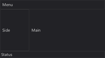
rect main = ui->root_area; rect menu = r_cut_px(R_TOP, &main, 32, R_SALT00); rect status = r_cut_px(R_BOTTOM, &main, 24, R_SALT01); rect side = r_cut_px(R_LEFT, &main, 100, R_SALT02); r_panel(ui, menu, R_STYLE_PANEL); r_panel(ui, status, R_STYLE_PANEL); r_panel(ui, side, R_STYLE_PANEL); r_label(ui, r_shrink(menu, 8), "Menu"); r_label(ui, r_shrink(status, 4), "Status"); r_label(ui, r_shrink(side, 8), "Side"); r_label(ui, r_shrink(main, 8), "Main");

A typical application layout: menu, status and side bar are cut from the window, main is what remains.
typedef enum r_alignment { R_BOTTOM = (1 << 0), R_V_CENTER = (1 << 1), R_TOP = (1 << 2), R_LEFT = (1 << 3), R_H_CENTER = (1 << 4), R_RIGHT = (1 << 5), // R_TOP_LEFT = R_TOP | R_LEFT, R_BOTTOM_LEFT = R_BOTTOM | R_LEFT, R_TOP_RIGHT = R_TOP | R_RIGHT, R_BOTTOM_RIGHT = R_BOTTOM | R_RIGHT, R_TOP_CENTER = R_TOP | R_H_CENTER, R_BOTTOM_CENTER = R_BOTTOM | R_H_CENTER, R_LEFT_CENTER = R_LEFT | R_V_CENTER, R_RIGHT_CENTER = R_RIGHT | R_V_CENTER, R_CENTER = R_H_CENTER | R_V_CENTER, } r_alignment;
Bit flags, combine one vertical (R_TOP, R_V_CENTER, R_BOTTOM) and one horizontal (R_LEFT, R_H_CENTER, R_RIGHT) flag. A missing axis means centered. Functions that only need a side, like r_cut_px or r_stack, take a single flag.
rect rect_expand_pt(rect a, int x, int y); rect rect_expand(rect a, rect b);
Returns the smallest rectangle containing both a and b with the ID of a, rect_expand_pt does the same for a point.
See also: rect_intersect, r_grow
Concepts: rect
rect rect_intersect(rect a, rect b);
Returns the overlap of a and b with the ID of a, its size is 0 if they don't overlap.
See also: rect_expand
Concepts: rect
rect r_cut_fraction(r_alignment dir, rect* to_cut, float fraction, uint64_t salt);
Like r_cut_px, but cuts fraction (0 to 1) of the current width or height of to_cut.
void r_cut_group(r_alignment dir, rect* to_cut, rect** r, int num_rects);
Cuts one rectangle per entry of r from to_cut, sized by each entry's current width or height.
See also: r_cut_px, r_expand_group
rect r_expand_px(r_alignment dir, rect* to_expand, int pixels, uint64_t salt);
Grows to_expand by pixels towards dir and returns the added area.
See also: r_cut_px, r_expand_group
Concepts: rect
void r_expand_group(r_alignment dir, rect* to_expand, rect** r, int num_rects);
Grows to_expand once per entry of r, sized by each entry's current width or height, and stores the added areas in r.
See also: r_expand_px, r_cut_group
Concepts: rect
rect r_offset(rect r, int x_offset, int y_offset);
Moves a rectangle by the given offset, keeping its ID.
Concepts: rect
rect r_grow(rect r, int pixels); rect r_grow_sides(rect r, int left, int top, int right, int bottom);
Grows a rectangle by pixels on all sides, or per side with r_grow_sides, keeping its ID.
Concepts: rect
rect r_shrink(rect r, int pixels); rect r_shrink_sides(rect r, int left, int top, int right, int bottom);
Shrinks a rectangle by pixels on all sides, or per side with r_shrink_sides, keeping its ID.
Concepts: rect
void r_min_size(rect *r, int w, int h);
Enlarges the rectangle to at least w by h pixels.
See also: r_fill
Concepts: rect
void r_fill(r_alignment dir, rect target, rect** r, int num_rects);
Distributes the free space of target evenly among the rects in r and places them next to each other along dir. R_LEFT/R_RIGHT arranges them horizontally, R_TOP/R_BOTTOM vertically, R_RIGHT/R_BOTTOM start at the far end. On the other axis each rect is stretched to fill target.
rect name = { .w = 80 }, value = { .w = 40 };
r_fill(R_LEFT, row, (rect*[]){ &name, &value }, 2);
The rectangles should be initialized with their minimum sizes before calling.
Every rect carries a 64 bit id. rcut uses it to recognize elements across rebuilds: hover, focus and pressed state as well as widget data like a text cursor are looked up by ID. IDs must be unique within a UI list and stable between rebuilds.
You rarely assign IDs by hand. Every function that derives a rect from another also derives the new ID from the old one, e.g. r_cut_px, r_aligned or r_next. Salting is the explicit form of this: mixing a number into an ID to get a different but reproducible ID.
enum r_salts { R_SALT00 = 1009, R_SALT01 = 1013, R_SALT02 = 1019, R_SALT03 = 1021, R_SALT04 = 1031, R_SALT05 = 1033, R_SALT06 = 1039, R_SALT07 = 1049, R_SALT08 = 1051, R_SALT09 = 1061, R_SALT10 = 1063, R_SALT11 = 1069, R_SALT12 = 1087, R_SALT13 = 1091, R_SALT14 = 1093, R_SALT15 = 1097, R_SALT16 = 1103, R_SALT17 = 1109, R_SALT18 = 1117, R_SALT19 = 1123, R_SALT20 = 1129, };
Predefined salt values for r_salt and the cutting functions. You can use these freely or use your own values. There are no "bad" salts other than reusing the same salt at multiple places.
rect r_salt(rect r, uint64_t salt);
Returns r with a new ID derived from r's rect.id and salt. Use it when deriving several elements from the same rect, e.g. two buttons aligned in the same area, which would otherwise get the same ID.
Some salts you can use freely (R_SALT00 to R_SALT20). Don't worry any salt will do, you can also just write down a random number.
rect area = r_shrink(ui->root_area, 12); rect size = { .w = 90, .h = 32 }; rect yes = r_aligned(R_LEFT_CENTER, area, r_salt(size, R_SALT00)); rect no = r_aligned(R_RIGHT_CENTER, area, r_salt(size, R_SALT01)); r_button(ui, yes, "Yes"); r_button(ui, no, "No");

See also: r_cut_px
Alignment functions position a rect relative to another without changing its size. r_align and r_aside modify the rect in place, r_aligned returns a new one. The _fraction variants take the position as fractions (0 = left/top, 1 = right/bottom) instead of r_alignment flags, the _group variants move several rects by the same offset as the first.
void r_align(r_alignment corner, rect target, rect* r); void r_align_group(r_alignment corner, rect target, rect** r, int num_rects); void r_align_fraction(rect target, rect* r, float x_fraction, float y_fraction);
Moves r into the given corner or edge of target, keeping its size. The new ID is derived from both rects.
rect r_aligned(r_alignment corner, rect target, rect src); rect r_aligned_fraction(rect target, rect src, float x_fraction, float y_fraction);
Returns src positioned inside target like r_align. Handy for one-off rects: r_aligned(R_CENTER, area, (rect){ .w = 100, .h = 32 }).
void r_aside(r_alignment corner, rect target, rect* r); void r_aside_group(r_alignment corner, rect target, rect** r, int num_rects); void r_aside_fraction(rect target, rect* r, float x_fraction, float y_fraction);
Places r outside of target, touching the given side and centered on the other axis: R_RIGHT puts it right of target. For corners the vertical side wins, R_TOP | R_RIGHT puts it above target, right aligned.
void r_relative_to_fraction(rect target, rect* r, float x_fraction, float y_fraction); void r_relative_to(r_alignment corner, rect target, rect* r);
Offsets r by the position of a corner of target, treating rect.x and rect.y of r as relative to that corner. R_TOP_LEFT makes r relative to target's origin.
Layout iterators hand out consecutive rects from an area: each r_next cuts the next one off in the iterator's direction, with spacing in between. They are plain structs on the stack and can be nested freely by using a rect of one iterator as the area of another.
Stack layouts (r_stack, r_layout) cut in one direction, flow layouts (r_flow_begin) place elements left to right and wrap. IDs of the returned rects are derived from the start area's ID and the element index.
typedef struct r_layout_iter { r_ui_list* l; rect start; rect area; r_alignment dir; int size; int spacing; int count; r_drawable* bg; int style; int line_h; int line_first; rect last; r_layout_type type; } r_layout_iter;
area is the space left, size and spacing are the defaults used by r_next, both can be changed at any time. last is the rect returned last. The remaining fields are internal.
typedef enum r_layout_type { R_LAYOUT_STACK, // Cuts consecutive rectangles in the direction `dir`. R_LAYOUT_FLOW, // Places rectangles left to right, wrapping into new lines aligned by `dir`. } r_layout_type;
How a layout iterator places its rectangles.
r_layout_iter r_stack(r_ui_list* l, rect area, r_alignment dir);
Starts a stack layout in area cutting from the dir side: R_TOP stacks downwards, R_LEFT left to right, R_BOTTOM and R_RIGHT start at the opposite ends. Default size and spacing come from the fallback style, use r_layout for those of a specific style.
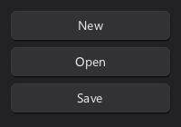
r_layout_iter it = r_stack(ui, r_shrink(ui->root_area, 12), R_TOP); r_button(ui, r_next(&it, -1), "New"); r_button(ui, r_next(&it, -1), "Open"); r_button(ui, r_next(&it, -1), "Save");

See also: r_next, r_remaining
Concepts: layout_iter
rect r_next(r_layout_iter* s, int size); rect r_next_fraction(r_layout_iter* s, float fraction); rect r_next_fit(r_layout_iter* s, int style, const char* text); rect r_next_fit_ex(r_layout_iter* s, int style, int icon, const char* text); rect r_next_keyed(r_layout_iter* s, int size, uint64_t key);
Returns the next size pixels of the layout, preceded by the iterator's spacing unless it's the first element. A negative size uses the default size.
r_next_fraction: a fraction of the remaining space, 1.0f / (n - i) splits it evenly among n elements.r_next_fit, r_next_fit_ex: just large enough for the text (and icon) in the given style.r_next_keyed: derives the ID from key instead of the element index, keeping IDs stable when elements are inserted or removed.r_layout_iter cols = r_stack(ui, r_shrink(ui->root_area, 12), R_LEFT); for(int i = 0; i < 3; i++) r_button(ui, r_next_fraction(&cols, 1.0f / (3 - i)), (char*[]){ "Low", "Medium", "High" }[i]);

Three equally sized columns using r_next_fraction.
Concepts: layout_iter
rect r_remaining(r_layout_iter* s);
Returns all space left in the layout iterator.
Concepts: layout_iter
rect r_last(r_layout_iter* s);
Returns the rectangle the layout iterator returned last, to place several elements on the same rectangle.
Concepts: layout_iter
r_layout_iter r_layout(r_ui_list* l, rect area, r_alignment dir, int style); r_layout_iter r_layout_rows(r_ui_list* l, rect area, int style); r_layout_iter r_layout_columns(r_ui_list* l, rect area, int style);
Like r_stack, but default size and spacing come from the theme for style, e.g. R_STYLE_BUTTON for the theme's button height. r_layout_rows and r_layout_columns are shorthands for R_TOP and R_LEFT.
Concepts: layout_iter, drawable
void r_gap(r_layout_iter* s, int size);
Skips size pixels of the layout iterator's remaining area.
Concepts: layout_iter
r_layout_iter r_row(r_layout_iter* s, int size, r_alignment dir);
Takes the next size pixels of s and returns a stack layout inside it cutting from dir, inheriting size and spacing. Typically used to place elements side by side within a vertical layout.
Concepts: layout_iter
r_layout_iter r_group_begin(r_layout_iter* parent, int style);
Starts a nested vertical layout in the remaining space of parent. If style is non-zero a background of that style is added and the content is placed inside its padding. The group's size is determined by r_group_end.
Concepts: layout_iter, drawable
rect r_group_end(r_layout_iter* group, r_layout_iter* parent);
Ends the group, takes the space it used from parent and returns that rect. The background added by r_group_begin is resized to fit the content.
Concepts: layout_iter, drawable
<TODO: Explain rich text>
r_layout_iter r_flow_begin(r_layout_iter* parent, int style, r_alignment align);
Starts a flow layout inside parent: elements are placed left to right and wrap into new lines.
The horizontal bits of align align each line, the vertical bits align the elements within a line.
Concepts: layout_iter, alignment, rich_text
void r_text(r_layout_iter* flow, int style, const char* text);
Adds word-wrapped text to a flow layout, split into one label per line, using the flow's style if style is 0.
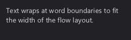
r_layout_iter it = r_stack(ui, r_shrink(ui->root_area, 12), R_TOP); r_layout_iter flow = r_flow_begin(&it, R_STYLE_LABEL, R_TOP_LEFT); r_text(&flow, 0, "Text wraps at word boundaries to fit the width of the flow layout."); r_flow_end(&flow, &it);

Concepts: layout_iter, drawable, rich_text
rect r_flow_end(r_layout_iter* flow, r_layout_iter* parent);
Finishes the last line and takes the used height from parent like r_group_end. Returns the rect the flow occupies.
Concepts: layout_iter, rich_text
A UI list (r_ui_list) is a flat list of r_drawables and r_interactables, everything rcut shows lives in one. Building UI means appending to a list: there is no widget tree and there are no widget objects, a button is a drawable plus an interactable with the same rect.
Lists are rebuilt as a whole, see r_list_clear. Each window has a root list (r_sdl_frontend.root in rcut_sdl), popups, tab pages and scroll areas are child lists, see Ephemerals.
struct r_ui_list { r_context* context; // context = NULL indicates a free slot. void* userptr; // If non-zero this list is treated like a popup: it uses the coordinate system and event loop of the parent, but is rendered to it's own target. struct r_ui_list* ephemeral_parent; // Single linked list for iteration. // [List Idx 0][Child of List Idx 0][Child of Child of List Idx 0][List Idx 1][List Idx 2] struct r_ui_list* chain_prev; struct r_ui_list* chain_next; int generation; int parent_generation; // Compared to ephemeral_parent->generation to recognize when the parent is deleted. char* title; uint64_t target; // Usually it refers to a window, but can also be a render target or similar. Can be a simple index, or a pointer, or a handle depending on frontend. bool is_ephemeral:1; // Ephemeral lists are deleted if they weren't recreated/kept alive during a rebuild. bool is_masked:1; // Wheter to apply the root_area as scissor during rendering. bool is_hidden:1; // Can be used by tabs and popups. bool block_event_fallthrough:1; // If false, events get "bubbled up" to other r_ui_lists with the same target. bool block_accelerator_mode:1; // If true, Alt will not enter accelerator mode while focus is inside this UI list. bool needs_redraw:1; bool resized:1; // Set when the root_area of a root list changed size, cleared by r_list_clear. bool needs_ephemeral_sweep:1; // Is set to true when a ephemeral was marked to be deleted. This allows cleaning up ephemeral lists without regular list rebuilds. bool is_marked_as_unused:1; bool is_marked_as_to_delete:1; bool is_modal:1; bool is_viewport:1; bool is_tooltip:1; bool has_scrollbar:1; bool close_on_outside_click:1; bool use_transform_matrix:1; float content_transform[2][3]; float scroll_x, scroll_y; // Area that is representitive of what space this UI list visually fills. Viewports get masked to this area. The X/Y coordinate is 0, 0 for windows as it's relative to their own coordinate system. rect root_area; // Determines min/max for scrollable viewports. rect document_area; uint64_t anchor_id; //rect global_mapping; // Where the ui_list is being displayed in global screen coordinates. int frame_parity; uint32_t build_count; r_paged_buffer draw_buffers[2]; r_drawable* draw_items; r_drawable* draw_items_last_frame; int count_draw_items; int count_draw_items_last_frame; r_paged_buffer interact_buffers[2]; r_interact* interact_items; r_interact* interact_items_last_frame; int count_interact_items; int count_interact_last_frame; r_paged_buffer storage_buffers[2]; uint8_t* storage_buffer; uint8_t* storage_buffer_last_frame; int storage_buffer_cur_tail; int storage_buffer_last_tail; r_hashmap id_hash[2]; rect drawn_area; uint64_t drawn_target; rect damage; };
Fields relevant when building UI:
root_area: the area the list fills, 0, 0, width, height for a window.document_area: content area of tab pages and scroll areas.resized: set when the window was resized, cleared by r_list_clear.userptr: free for application use.The remaining fields are internal.
See also: r_create_ui_list, r_list_clear
#define RCUT_LIST_MAX_ELEMENTS 4096 // ~4 millionths of address space per r_ui_list #define RCUT_LIST_MAX_ELEMENTS 65535 // ~1 billionths of address space per r_ui_list
Maximum number of drawables and interactables of a r_ui_list: 65535 on 64 bit and 4096 on 32 bit systems. The memory is only reserved up front and committed when needed, so a high limit mostly costs address space.
r_ui_list* r_create_ui_list(r_context* c, uint64_t target, uint64_t root_id, int width, int height); r_ui_list* r_create_ui_list_ex(r_context* c, uint64_t target, uint64_t root_id, int width, int height, int max_drawables, int max_interactables);
Creates a new UI list, it continues to exist until deleted by r_destroy_ui_list.
UI lists store everything in rcut, in particular r_interactables and r_drawables.
Each UI list can be cleared and regenerated independently of each other.
target is a opaque target ID, usually referring to a window or render target. All coordinates are within that targets space.
With rcut_sdl target 0 is the main window, see r_sdl_dialog for more windows.
r_create_ui_list_ex takes explicit capacities instead of RCUT_LIST_MAX_ELEMENTS.
r_ui_list* l = r_create_ui_list_ex(&f->context, 0, 100, 320, 80, 16, 4); r_label(l, r_shrink(l->root_area, 16), "Hello from a second list");

See also: r_destroy_ui_list, r_popup, r_viewport, r_scroll_begin
void r_destroy_ui_list(r_ui_list* list);
Destroys the target UI List.
r_create_ui_list. All other functions that create UI lists are "ephemeral", meaning they automatically get garbage collected if they are not renewed in the next two rebuilds.r_ui_list* dialog = r_sdl_dialog(f, 200, 320, 160, "Settings"); if(r_sdl_close_requested(f, dialog, true)) r_destroy_ui_list(dialog);
See also: r_create_ui_list, r_list_set_visibility, r_sdl_close_requested, r_ephemeral_create
void r_list_set_visibility(r_ui_list* list, bool visible);
Shows or hides the list, a hidden list and its child lists are not drawn and receive no input.
See also: r_list_is_visible, r_create_ui_list
Concepts: ui_list
rect r_list_get_content_rect(r_ui_list* list);
Returns the bounding rectangle of all drawables in the list, in list space.
See also: r_scroll_end, rect_expand
bool r_list_is_visible(r_ui_list* l);
Returns false if the list or any of its parent lists is hidden.
See also: r_list_set_visibility
Concepts: ui_list
void r_list_print(r_ui_list* l);
Prints the list's drawables and interactables to stdout for debugging.
See also: r_ui_list
Concepts: ui_list, drawable, interactable
rcut is not immediate mode: lists are only rebuilt when the UI's structure changes, e.g. after a resize (r_ui_list.resized) or when elements are added or removed. Input and changes to bound values (R_PTR) are handled without a rebuild.
A rebuild is r_list_clear followed by the building code. Focus, hover and widget state like a text cursor survive as long as elements keep their IDs.
void r_list_clear(r_ui_list* list);
Starts a rebuild: the current contents become the previous frame and the list is emptied. The previous frame is kept until the next clear, so state can be carried over by ID, see r_list_find_last_frame_interact.
if(ui->resized) { r_list_clear(ui); r_button(ui, r_shrink(ui->root_area, 16), "Rebuilt"); }
void r_list_reconcile(r_ui_list* list);
Updates focus, hover and drag state to the list's current contents, e.g. moves focus away from an element that no longer exists. Done automatically on input and visibility changes, only call it if you need that state to be correct right after a rebuild.
Concepts: rebuild, ui_list, interactable
A target is what a root list is drawn into, usually a window. It's an opaque uint64_t whose meaning is up to the frontend, rcut_sdl uses window indices with 0 being the main window. Child lists share their parent's coordinate system, but popups may be shown on a different target such as a window of their own.
void r_list_get_transform(r_ui_list* l, int* origin_x, int* origin_y, rect* clip);
Returns the list's origin in target space, scrolling included, and the rect it is clipped to. For root lists this is root_area, child lists are offset by their parents.
Ephemerals are child lists with automatic lifetime: they are created while building their parent and destroyed when the parent is rebuilt without creating them again. Popups, tooltips, tab pages and scroll areas are ephemerals. They are identified by an ID, so the same popup is found again across rebuilds.
#define RCUT_EPHEMERAL_MAX_ELEMENTS 256 // Tooltips, all other lists use RCUT_LIST_MAX_ELEMENTS #define RCUT_EPHEMERAL_MAX_ELEMENTS 512 // Tooltips, all other lists use RCUT_LIST_MAX_ELEMENTS
Maximum number of elements of a tooltip list, all other lists use RCUT_LIST_MAX_ELEMENTS.
See also: RCUT_LIST_MAX_ELEMENTS, r_tooltip, r_popup
r_ui_list* r_ephemeral_create(r_ui_list* parent, rect anchor, uint64_t id); r_ui_list* r_ephemeral_create_ex(r_ui_list* parent, rect anchor, uint64_t id, int max_drawables, int max_interactables); r_ui_list* r_ephemeral_create_or_find(r_ui_list* parent, rect anchor, uint64_t id);
Ephemerals are UI lists with automatic lifetime managment, garbage collected unless created or kept alive during a rebuild of their parent.
id is the lookup key, salt the anchor with r_salt to allow multiple ephemerals per item: r_salt(anchor, P400).id. anchor's rect.id is stored as anchor_id.
r_ephemeral_create: creates the list, or revives and clears an existing one.r_ephemeral_create_ex: explicit capacities like r_create_ui_list_ex, only applied on creation.r_ephemeral_create_or_find: returns an existing list unchanged, otherwise creates it.r_ephemeral_find: NULL if missing or destroyed, doesn't keep alive. Close with r_destroy_ui_list(r_ephemeral_find(parent, id)).r_ephemeral_keep_alive: like find, but keeps alive.See also: r_popup, r_viewport, r_destroy_ui_list
Concepts: ephemeral, ui_list, salting
r_ui_list* r_popup(r_ui_list* parent, rect anchor, uint32_t flags, uint64_t id);
Returns the popup with the given ID, creating it if necessary, an existing popup is returned unchanged. Its root_area is anchor, position it with r_popup_place. If the frontend supports it the popup gets a window of its own.
typedef enum r_popup_flags { R_POPUP_TOOLTIP = 1 << 0, // Only shows something: no input (the mouse goes to what's below), at most RCUT_EPHEMERAL_MAX_ELEMENTS elements. R_POPUP_AUTOCLOSE = 1 << 1, // Clicking outside of it (and its child popups) or pressing Escape closes it (close_on_outside_click). For menus. } r_popup_flags;
R_POPUP_TOOLTIP for display only popups, R_POPUP_AUTOCLOSE for menus closing on outside clicks or Escape. 0 for a popup that stays open until destroyed.
r_ui_list* r_viewport(r_ui_list* parent, rect anchor, uint64_t id);
Creates a child list drawn inside anchor of its parent and clipped to it, its contents use coordinates relative to anchor. It is cleared on every call, build its contents afterwards. Used for scroll areas and tab pages.
r_ui_list* r_scroll_begin(r_ui_list* parent, rect r);
r_ui_list* r_scroll_begin_ex(r_ui_list* parent, rect r, int frame_style);
Returns a viewport for r with room for a vertical scrollbar on the right. Build the scrollable content into it, then call r_scroll_end. r_scroll_begin_ex additionally draws a frame of frame_style around it.
r_ui_list* v = r_scroll_begin(ui, area);
r_layout_iter it = r_stack(v, (rect){ 0, 0, v->root_area.w, 100000, v->root_area.id }, R_TOP);
for(int i = 0; i < 100; i++)
r_label(v, r_next(&it, 24), "Line");
r_scroll_end(ui, v);
void r_scroll_end(r_ui_list* parent, r_ui_list* viewport);
Computes the content height from the viewport's drawables, clamps the scroll position and adds the scrollbar and mouse wheel handling to parent.
void r_scroll_to(r_ui_list* viewport, float x, float y);
Scrolls so that x, y in content coordinates is the top left corner of the visible area, clamped to the content size.
rect r_popup_place(r_ui_list* parent, rect anchor, int w, int h, r_alignment side);
Returns a w by h rect next to anchor: below it, or right of it with R_RIGHT. Flips to the opposite side if there's not enough room and is clamped to the window.
Concepts: ephemeral, alignment
bool r_close_popups(r_context* c, bool only_topmost);
Closes popups opened with R_POPUP_AUTOCLOSE, only the topmost one if only_topmost is set. Returns true if anything was closed.
Concepts: ephemeral
A drawable (r_drawable) is a rect with a style and optionally text, an icon or an image. Drawables are pure data, the renderer (rcut_draw or your own) decides how a style looks. They are drawn in the order they were added. High level functions like r_button add them for you, r_style and r_labeled add them directly.
typedef struct r_drawable { rect r; uint64_t parent_id; // Inherits hovered/pressed/focus state and damage state from parent_id. Will be 0 most of the time. int style; // r_style int outer_style; // A style hint to allow for minor style adjustments for nested drawables. Will be 0 most of the time. // Label = Text + Icon char* text; int icon; int16_t label_offset_x, label_offset_y; void* layout_cache; // The actual positions of each glyph, mainly used for shaped text. r_image_buffer* image_data; // Drawn as background inside the stylebox border. struct r_dynamic_rect_data* dynamic; } r_drawable;
r, style: where and how to draw.text, icon: label content. Text is not copied, it must stay valid until the next rebuild.parent_id: inherit hover, pressed and focus state from the element with this ID, used for parts of widgets.outer_style: style of the enclosing element, e.g. of the button a label is in.image_data: image drawn inside the stylebox.dynamic: bound value the drawable follows without a rebuild.r_drawable* r_style(r_ui_list* l, rect r, int style);
Adds a drawable of style covering r and returns it to set further fields. The basic building block for custom widgets.
Concepts: drawable
r_drawable* r_labeled(r_ui_list* l, rect r, int style, const char* text);
Adds a drawable of style with text placed inside its padding, like a button without interaction.
Concepts: drawable
r_drawable* r_list_find_this_frame_drawable(r_ui_list* list, uint64_t id);
Returns the drawable with the given ID from the current frame, or NULL.
See also: r_list_find_last_frame_drawable, r_drawable
r_drawable* r_list_find_last_frame_drawable(r_ui_list* list, uint64_t id);
Returns the drawable with the given ID from before the last r_list_clear, or NULL.
typedef enum r_dynamic_rect_kind { R_DYN_STATIC, // No custom update. R_DYN_ALIGNED, // Align by fraction. R_DYN_FILLED, // Stretch by fraction. R_DYN_TOGGLED, // Draw with state if toggled. R_DYN_CUSTOM, // Custom update function. } r_dynamic_rect_kind;
How a dynamic drawable follows its binding: R_DYN_ALIGNED moves it (slider thumbs), R_DYN_FILLED resizes it (progress bars), R_DYN_TOGGLED adds a state while the binding matches (checkboxes), R_DYN_CUSTOM calls an update function.
typedef struct r_dynamic_rect_data { uint8_t kind; r_data_binding binding; double drawn; union{ struct{ rect area; float min, max; r_alignment from; } aligned, filled; struct{ int64_t value; bool set_value; int state; int icon; } toggled; struct{ void (*update)(r_context* c, r_drawable* d); void* data; } custom; }; } r_dynamic_rect_data;
Binding and parameters of a dynamic drawable, set up by r_drawable_thumb, r_drawable_fill, r_drawable_toggled and r_drawable_custom. drawn is the bound value at the last draw.
bool r_drawable_take_change(r_drawable* d, rect* damage);
Returns true and the area to redraw in damage if the drawable's bound value changed since it was last drawn or its image needs uploading. Used by renderers to only redraw what changed.
rect r_inner(r_context* c, int style, rect outer);
Returns the content rectangle of an element with the style, given its outer rectangle.
See also: r_outer, r_draw_stylebox_inner_rect
rect r_outer(r_context* c, int style, rect* inner);
Returns the outer rectangle an element with the style needs to fit the content rectangle inner.
See also: r_inner, r_measure, r_draw_stylebox_outer_rect
rect r_with_margins(r_context* c, int style, rect outer);
Grows the outer rectangle by half the style's default spacing on every side.
See also: r_remove_margins, r_layout_default_spacing
rect r_remove_margins(r_context* c, int style, rect with_margins);
Removes the margins added by r_with_margins.
See also: r_with_margins
int r_layout_default_size(r_context* c, int style);
Returns the theme's default element size for the style, 28 if the frontend provides none.
See also: r_layout_default_spacing, r_theme_layout, r_interface
int r_layout_default_spacing(r_context* c, int style);
Returns the theme's default spacing between elements of the style, 8 if the frontend provides none.
See also: r_layout_default_size, r_theme_layout
rect r_measure(r_context* c, int style, const char* label); rect r_measure_n(r_context* c, int style, const char* text, int len); rect r_measure_ex(r_context* c, int style, int icon, const char* text);
Returns the size of label in style, the content without padding. r_measure_n measures the first len bytes, r_measure_ex includes an icon.
void r_style_measure_all(r_context* c, int style, const char* label, rect* outer_with_margins, rect* outer, rect* inner);
Measures label and returns three sizes: inner is the content, outer includes padding (r_outer) and outer_with_margins also includes the default spacing (r_with_margins), it may be NULL.
An interactable (r_interact) is a rect receiving input, callbacks are attached to it per event type. Interactables are identified by their rect's ID: using the same rect twice returns the same interactable, which is how widgets combine several callbacks.
typedef struct r_interact { r_ui_list* owner; rect r; r_cursor cursor; bool traps_tab_focus : 1; // If true, you can't use tab to change focus while this element has keyboard focus. bool traps_alt_key : 1; // If true, you can't activate acclerator hotkeys while this element has keyboard focus. bool traps_arrow_focus : 1; // If true, you can't use arrow keys to change the focus after pressing tab while this element has keyboard focus. int accelerator_key; // Alt + this key will send a ACTIVATION event to this interactable if not blocked. // Mouse-capture group. While captured, only interactables whose press_group // matches the captured group (or whose id == pressed_id) receive mouse events. // 0 means "only myself". Menu items set this to the menu button's group id. uint64_t press_group; r_callback* callbacks; // Linked list // Tab focusing. These are overrides, if NULL a default value will be computed. struct r_interact* next_focus; // Switch to this element on pressing Tab. struct r_interact* previous_focus; // Switch to this element on pressing Shift-Tab. // Arrow key focus. struct r_interact* directional_focus[4]; // Switch to this element when pressing Up/Left/Down/Right struct r_dynamic_rect_data* dynamic; } r_interact;
r: the hit area.cursor: mouse cursor while hovered.traps_tab_focus, traps_alt_key, traps_arrow_focus: keep Tab, Alt or arrow keys from moving focus while focused, e.g. for text inputs.accelerator_key: Alt + this key activates the element.press_group: see r_set_press_group.next_focus, previous_focus, directional_focus: override keyboard navigation, NULL for automatic.callbacks: linked list of r_callbacks.r_interact* r_interactable(r_ui_list* l, rect r); r_interact* r_interactable_new(r_ui_list* l, rect r);
Returns the interactable with r's ID, creating it if the current build has none yet. r_interactable_new always creates one, allowing several hit areas with the same ID, like the buttons of a spin box.
Concepts: interactable
void r_set_press_group(r_ui_list* l, rect r, uint64_t group_id);
Sets the mouse capture group of the interactable at r. While an element is pressed only it and elements of its group receive mouse events. Menus use this so the mouse can be dragged from a menu button onto an item.
Concepts: interactable, input
r_interact* r_find_interact(r_context* c, uint64_t id);
Returns the visible interactable with the given ID, or NULL.
See also: r_list_find_this_frame_interact, r_interact
Concepts: interactable
r_interact* r_list_find_this_frame_interact(r_ui_list* list, uint64_t id);
Returns the interactable with the given ID from the current frame, or NULL.
See also: r_list_find_last_frame_interact, r_find_interact
Concepts: interactable, rebuild
r_interact* r_list_find_last_frame_interact(r_ui_list* list, uint64_t id);
Returns the interactable with the given ID from before the last r_list_clear, or NULL.
Concepts: interactable, rebuild
struct r_callback { r_event_type event; r_callback_fn* function; // Persistent data is stored in r_ui_list. void* data; int size; // The label that will be used in the context menu to represent this R_CONTEXT callback. char* menu_label; // The hotkey that triggers the R_CONTEXT callback. It will also be displayed in the context menu. uint32_t hotkey; uint32_t hotkey_modifier; // Linked list r_interact* parent; r_callback* next; };
event: the event type it handles.function: returns true if it handled the event.data, size: data owned by the list, see r_callback_set_data and r_copy_last_frame_data.menu_label, hotkey, hotkey_modifier: for R_CONTEXT callbacks, shown in the context menu.parent: the owning interactable.bool r_is_pressed_visual(r_context* c, uint64_t id);
Returns true if the element should look pressed: it is pressed and the mouse is still over it.
See also: r_draw_take_damage
Concepts: interactable, drawable
void r_change_focus(r_context* c, r_interact* new_focus);
Moves the keyboard focus to new_focus, or clears it if NULL, and sends R_FOCUS_EXIT and R_FOCUS_ENTER.
See also: r_event_type, r_focus_wants_text
Concepts: interactable, input
bool r_focus_wants_text(r_context* c);
Returns true if the focused element accepts text input.
See also: r_post_text, r_change_focus
Concepts: interactable, input
r_cursor r_hover_cursor(r_context* c);
Returns the mouse cursor of the hovered or dragged element.
See also: r_cursor
Concepts: interactable, input, frontend
typedef enum r_cursor { R_CURSOR_DEFAULT, R_CURSOR_TEXT, R_CURSOR_HAND, R_CURSOR_RESIZE_H, // Left-right R_CURSOR_RESIZE_V, // Up-down } r_cursor;
Mouse cursor shapes, see r_hover_cursor.
See also: r_hover_cursor, r_interact
Widgets don't store values, they read and write them through a binding (r_data_binding). A binding either points to a variable (R_PTR, R_BITFIELD) or wraps a getter and setter (R_GETSET). Bound values are read when drawing, so changes show up without a rebuild.
typedef struct { bool use_function_indirection; union{ struct{ r_data_type ptr_type; void* ptr; int num_bits; int bit_offset; }; struct{ r_fn* getter; r_fn* setter; r_signature setter_sig; r_signature getter_sig; uint64_t index; void* pointer; }; }; } r_data_binding;
Passed by value. Without use_function_indirection it refers to a variable through ptr, otherwise to a getter and setter. Create it with R_PTR, R_BITFIELD or R_GETSET.
#define R_PTR(P) ((r_data_binding){ \ .ptr = (void*)(P), \ .num_bits = (int)(sizeof(*(P)) * 8), \ .ptr_type = R_TYPEOF(*(P)) })
Binds the variable P points to. The type is detected with _Generic: bool, any integer type, float and double are supported.
static bool mute = true; // [...] r_checkbox(ui, ui->root_area, "Mute", R_PTR(&mute));
#define R_BITFIELD(BASE, OFFSET, LENGTH) ((r_data_binding){ \ .ptr = (void*)(BASE), \ .num_bits = (LENGTH), \ .bit_offset = (OFFSET), \ .ptr_type = R_TYPEOF(*(BASE)) })
Binds LENGTH bits starting at bit OFFSET of the integer at BASE.
See also: R_PTR, R_GETSET, r_data_binding
#define R_GETSET(...) r_data_compact((r_data_desc){ __VA_ARGS__ })
Binds through functions, taking designated initializers for r_data_desc. Use it to convert units or to react to changes.
static float get_gain(void); static void set_gain(float gain); // [...] r_slider_h(ui, r, 0, 1, 0.01f, R_GETSET(.getter_f32 = get_gain, .setter_f32 = set_gain));
typedef struct r_data_desc { #define X(tag, ret) ret (*getter_##tag)(void); ret (*getter_##tag ##_i32)(int); ret (*getter_##tag ##_u64)(uint64_t); ret (*getter_##tag ##_ptr)(void*); ret (*getter_##tag ##_ptr_i32)(void*); R_SIGNATURE_LIST(X) #undef X #define X(tag, target_type) void (*setter_##tag)(target_type); void (*setter_i32_##tag)(int, target_type); void (*setter_u64_##tag)(uint64_t, target_type); void (*setter_ptr_##tag)(void*, target_type); void (*setter_ptr_i32_##tag)(void*, int32_t, target_type); R_SIGNATURE_LIST(X) #undef X uint64_t index; void* pointer; } r_data_desc;
Fields for R_GETSET, set one getter and one setter. Names are getter_TYPE and setter_TYPE with TYPE being b, i32, i64, u32, u64, f32 or f64. Variants with i32/u64 pass index and with ptr pass pointer as additional argument.
typedef enum r_data_type { R_BOOL, // True if any bit is set, false if none is set. R_FLOAT, // Only 32 bit (float) and 64 bit (double) supported. R_INT, // Most significant bit is sign bit. R_UINT, // Always positive. } r_data_type;
Type of the value a pointer binding refers to.
See also: R_PTR, r_data_binding
void r_seti(r_data_binding binding, int64_t value);
Writes an integer to the binding, converted to the bound type.
See also: r_geti, r_setd, r_data_binding
Concepts: binding
int64_t r_geti(r_data_binding binding);
Reads the binding as an integer.
Concepts: binding
void r_setd(r_data_binding binding, double value);
Writes a double to the binding, converted to the bound type.
Concepts: binding
double r_getd(r_data_binding binding);
Reads the binding as a double.
Concepts: binding
void r_button(r_ui_list* l, rect r, const char* text); r_drawable* r_button_ex(r_ui_list* l, rect r, int style, int icon, const char* text);
A push button showing text. It does nothing by itself, attach an action with r_on_click using the same rect. r_button_ex takes a style and icon and returns the drawable.
rect ok = r_aligned(R_CENTER, ui->root_area, (rect){ .w = 100, .h = 32 }); r_button(ui, ok, "OK"); r_on_click(ui, ok, on_ok);

See also: r_on_click, r_icon
Concepts: drawable
void r_label(r_ui_list* l, rect r, const char* text); r_drawable* r_label_ex(r_ui_list* l, rect r, int style, int icon, const char* text); void r_label_value(r_ui_list* l, rect r, const char* fmt, r_data_binding binding);
Draws text in r. r_label_ex takes a style and icon and returns the drawable. r_label_value shows a bound value through a printf format with a single conversion and updates without a rebuild.
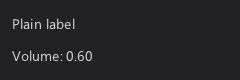
static float volume = 0.6f; // [...] r_layout_iter it = r_stack(ui, r_shrink(ui->root_area, 12), R_TOP); r_label(ui, r_next(&it, 24), "Plain label"); r_label_value(ui, r_next(&it, 24), "Volume: %.2f", R_PTR(&volume));

void r_on_click(r_ui_list* l, rect r, void (*on_click)(void)); void r_on_click_i32(r_ui_list* l, rect r, void (*on_click)(int32_t), int32_t value); void r_on_click_u64(r_ui_list* l, rect r, void (*on_click)(uint64_t), uint64_t value); void r_on_click_f32(r_ui_list* l, rect r, void (*on_click)(float), float value); void r_on_click_f64(r_ui_list* l, rect r, void (*on_click)(double), double value); void r_on_click_ptr(r_ui_list* l, rect r, void (*on_click)(void*), void* value); void r_on_click_ptr_i32(r_ui_list* l, rect r, void (*on_click)(void*, int32_t), void* ptr, int index);
Calls on_click when the element at r is activated: clicked, Enter while focused or its accelerator key. The _i32, _u64, _f32, _f64, _ptr and _ptr_i32 variants pass the given values to on_click, so one function can serve many elements.
r_layout_iter it = r_stack(ui, ui->root_area, R_TOP); for(int i = 0; i < 4; i++) { rect r = r_next(&it, -1); r_button(ui, r, "Item"); r_on_click_i32(ui, r, on_select, i); }
Concepts: callback
void r_checkbox(r_ui_list* l, rect r, const char* text, r_data_binding binding);
A checkbox with text next to it, toggling a bool binding.
| Parameter | |
|---|---|
binding | Bound value, true while checked. Any integer type works, see R_BITFIELD for flags. |
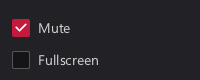
static bool mute = true; static bool fullscreen = false; // [...] r_layout_iter it = r_stack(ui, r_shrink(ui->root_area, 12), R_TOP); r_checkbox(ui, r_next(&it, -1), "Mute", R_PTR(&mute)); r_checkbox(ui, r_next(&it, -1), "Fullscreen", R_PTR(&fullscreen));

Concepts: binding
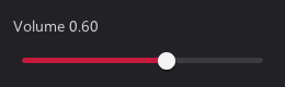
void r_slider_h(r_ui_list* l, rect r, float min, float max, float step, r_data_binding binding); void r_slider_v(r_ui_list* l, rect r, float min, float max, float step, r_data_binding binding);
Horizontal (r_slider_h) or vertical (r_slider_v) slider for values from min to max. Values snap to multiples of step from min, 0 for continuous. Arrow keys move by one step, ten with Shift, Home and End jump to the ends.
static float volume = 0.6f; // [...] r_layout_iter it = r_stack(ui, r_shrink(ui->root_area, 12), R_TOP); r_label_value(ui, r_next(&it, 24), "Volume %.2f", R_PTR(&volume)); r_slider_h(ui, r_next(&it, 24), 0, 1, 0.05f, R_PTR(&volume));

static float levels[3] = { 0.8f, 0.5f, 0.3f }; // [...] r_layout_iter row = r_stack(ui, r_shrink(ui->root_area, 12), R_LEFT); for(int i = 0; i < 3; i++) r_slider_v(ui, r_next(&row, 24), 0, 1, 0.05f, R_PTR(&levels[i]));

See also: r_slider_box, r_spinbox
Concepts: binding
enum r_style { R_STYLE_FALLBACK = 0, // If the style doesn't know how to draw something, it should fallback to drawing this instead. R_STYLE_WINDOW, R_STYLE_TOOLTIP, R_STYLE_BUTTON, R_STYLE_HEADER, R_STYLE_LABEL, R_STYLE_ICON, R_STYLE_TEXT, R_STYLE_INPUT, // Text areas with various misc functionalities R_STYLE_MENU_BG, R_STYLE_MENU_ITEM, R_STYLE_CONTEXT_MENU_BG, R_STYLE_CONTEXT_MENU_ITEM, R_STYLE_PANEL, R_STYLE_CHECKBOX, R_STYLE_RADIO, R_STYLE_TOGGLE, R_STYLE_SLIDEBOX, // Mix between slider and input box, with both numerical and drag input. R_STYLE_SLIDER, R_STYLE_SCROLLBAR, R_STYLE_MENUBAR_BG, R_STYLE_MENUBAR_ITEM, R_STYLE_INPUT_LINE_EDIT, R_STYLE_INPUT_MULTILINE_EDIT, R_STYLE_PROGRESS, R_STYLE_TAB, R_STYLE_TAB_BAR, R_STYLE_SEPARATOR, R_STYLE_COLLAPSIBLE, // Header of a collapsible section. R_STYLE_LIST_ITEM, // Selectable item in a list. R_STYLE_DROPDOWN, // Button that opens a selection popup. R_STYLE_SPINBOX, R_STYLE_BACKDROP, // Fills a window behind something modal. Unused since dialogs are root lists of their own. R_STYLE_DIALOG, R_STYLE_TAB_PAGE, // Background of the content below tabs. R_STYLE_SEGMENTED, // Joined choices, one is selected. R_STYLE_IMAGE, // No stylebox, only r_drawable.image_data. R_STYLE_BASE_MASK = 0xFF, R_FLAG_VERTICAL = R_BIT(0) << 8, // Vertical scrollbar/slider/separator, horizontal by default. R_FLAG_EMBEDDED = R_BIT(1) << 8, // Background adapts to the surrounding element (list, menu, context menu). R_FLAG_MASK = 0xFF << 8, R_STATE_SELECTED = R_BIT(0) << 16, // Selection in a menu. R_STATE_PRESSED = R_BIT(1) << 16, R_STATE_HOVER = R_BIT(2) << 16, R_STATE_DISABLED = R_BIT(3) << 16, R_STATE_TOGGLED = R_BIT(4) << 16, R_STATE_FOCUS = R_BIT(5) << 16, R_STATE_MASK = 0xFF << 16, R_VARIANT_FLAT = 1 << 24, // Usually means without border and the element is just implied through icon + label R_VARIANT_INSET = 2 << 24, // Inset panel. R_VARIANT_RAISED = 3 << 24, // Raised panel. R_VARIANT_PRIMARY = 4 << 24, // More colorful R_VARIANT_TERTIARY = 5 << 24, // Less color, flatter R_VARIANT_LIST_ITEM = 6 << 24, // Embedded in a list, should use a appropriate background for it R_VARIANT_MENU_ITEM = 7 << 24, // Embedded in a menu, should blend into it R_VARIANT_CUSTOM_1 = 8 << 24, R_VARIANT_CUSTOM_2 = 9 << 24, R_VARIANT_CUSTOM_3 = 10 << 24, R_VARIANT_CUSTOM_4 = 11 << 24, R_VARIANT_CUSTOM_5 = 12 << 24, R_VARIANT_CUSTOM_6 = 13 << 24, R_VARIANT_CUSTOM_7 = 14 << 24, R_VARIANT_CUSTOM_8 = 15 << 24, R_VARIANT_MASK = 0xF << 24, R_COMPONENT_JOINED = 1 << 28, // Part of an complex input, wedged inbetween endcaps. R_COMPONENT_ENDCAP_START = 2 << 28, // For example to create a text input with a popup selection then we have: R_COMPONENT_ENDCAP_END = 3 << 28, // [R_STYLE_INPUT | R_COMPONENT_ENDCAP_START][R_STYLE_BUTTON | R_COMPONENT_ENDCAP_END] R_COMPONENT_TRACK = 4 << 28, // Primary background for progress bars/sliders/scroll bar, behind joined components (with the style of the joined parts). R_COMPONENT_FILL = 5 << 28, // Alternative background for progress bars that indicate the progress. R_COMPONENT_THUMB = 6 << 28, // Draggable portion of slider/scroll bar. R_COMPONENT_CARET = 7 << 28, // Text cursor, blinks while focused. R_COMPONENT_SELECTION = 8 << 28, // Text selection highlight. R_COMPONENT_MASK = 0xF << 28, };
A style is a base style (R_STYLE_*) combined with optional flags, states, a variant and a component, e.g. R_STYLE_PANEL | R_VARIANT_INSET. States are set by widgets. Variants select alternative looks, components address parts of compound widgets like the thumb of a slider. Themes fall back to simpler combinations if they don't define a specific one.
void r_icon(r_ui_list* l, rect r, int style, int icon);
Draws a built-in icon (r_icon_variant) centered in r. style is the style of the enclosing element, 0 for default.
r_layout_iter it = r_stack(ui, r_shrink(ui->root_area, 12), R_LEFT); int icons[] = { R_ICON_HOME, R_ICON_FOLDER, R_ICON_SEARCH, R_ICON_SETTINGS, R_ICON_INFO }; for(int i = 0; i < 5; i++) r_icon(ui, r_next(&it, 24), 0, icons[i]);
Concepts: icon
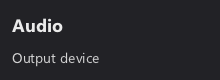
void r_header(r_ui_list* l, rect r, const char* text);
Draws a label with the header style.
r_layout_iter it = r_stack(ui, r_shrink(ui->root_area, 12), R_TOP); r_header(ui, r_next(&it, 28), "Audio"); r_label(ui, r_next(&it, 20), "Output device");

See also: r_label
Concepts: drawable
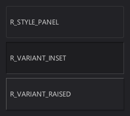
void r_panel(r_ui_list* l, rect r, int style);
Draws a background panel, using R_STYLE_PANEL if style is 0.
r_layout_iter rows = r_stack(ui, r_shrink(ui->root_area, 12), R_TOP); r_panel(ui, r_next(&rows, 64), 0); r_label(ui, r_shrink(r_last(&rows), 8), "R_STYLE_PANEL"); r_panel(ui, r_next(&rows, 64), R_STYLE_PANEL | R_VARIANT_INSET); r_label(ui, r_shrink(r_last(&rows), 8), "R_VARIANT_INSET"); r_panel(ui, r_next(&rows, 64), R_STYLE_PANEL | R_VARIANT_RAISED); r_label(ui, r_shrink(r_last(&rows), 8), "R_VARIANT_RAISED");

See also: r_style, r_separator
Concepts: drawable
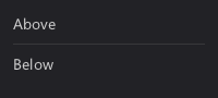
void r_separator(r_ui_list* l, rect r);
Draws a separator line through the center of r, horizontal if r is wider than tall, vertical otherwise.
r_layout_iter it = r_stack(ui, r_shrink(ui->root_area, 12), R_TOP); r_label(ui, r_next(&it, 20), "Above"); r_separator(ui, r_next(&it, 1)); r_label(ui, r_next(&it, 20), "Below");

Concepts: drawable
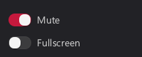
void r_toggle(r_ui_list* l, rect r, const char* text, r_data_binding binding);
A labeled switch that works like r_checkbox.
static bool mute = true; static bool fullscreen = false; // [...] r_layout_iter it = r_stack(ui, r_shrink(ui->root_area, 12), R_TOP); r_toggle(ui, r_next(&it, -1), "Mute", R_PTR(&mute)); r_toggle(ui, r_next(&it, -1), "Fullscreen", R_PTR(&fullscreen));

See also: r_checkbox, r_radio
Concepts: binding
void r_radio(r_ui_list* l, rect r, const char* text, int64_t value, r_data_binding binding);
A radio button, checked while the binding equals value, clicking it sets the binding to value. Use one binding with different values for a group.
static int quality = 1; // [...] r_layout_iter row = r_stack(ui, r_shrink(ui->root_area, 12), R_LEFT); char* labels[] = { "Low", "Medium", "High" }; for(int i = 0; i < 3; i++) r_radio(ui, r_next_fraction(&row, 1.0f / (3 - i)), labels[i], i, R_PTR(&quality));

Concepts: binding
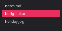
void r_selectable(r_ui_list* l, rect r, const char* text, int64_t value, r_data_binding binding);
A list item working like r_radio: selected while the binding equals value, clicking selects it.
static int selected = 1; // [...] r_layout_iter it = r_stack(ui, r_shrink(ui->root_area, 8), R_TOP); it.spacing = 2; char* files[] = { "notes.md", "budget.xlsx", "holiday.jpg" }; for(int i = 0; i < 3; i++) r_selectable(ui, r_next(&it, 26), files[i], i, R_PTR(&selected));

Concepts: binding
void r_slider_box(r_ui_list* l, rect r, const char* text, float min, float max, float step, r_data_binding binding);
A compact slider showing text and the value. Change it by dragging, with the mouse wheel or the arrow keys. step also determines the displayed precision.
static float brightness = 40; // [...] r_layout_iter it = r_stack(ui, r_shrink(ui->root_area, 12), R_TOP); r_slider_box(ui, r_next(&it, 26), "Brightness", 0, 100, 1, R_PTR(&brightness));

Concepts: binding
void r_spinbox(r_ui_list* l, rect r, float min, float max, float step, r_data_binding binding);
A number input with minus and plus buttons, holding a button repeats. The value can also be typed in or changed with the mouse wheel, Shift multiplies the step by ten. Values are clamped to min and max.
static float count = 3; // [...] rect r = r_aligned(R_CENTER, ui->root_area, (rect){ .w = 120, .h = 28 }); r_spinbox(ui, r, 0, 99, 1, R_PTR(&count));

Concepts: binding
void r_progress(r_ui_list* l, rect r, float min, float max, r_data_binding binding);
Draws a progress bar filled to the bound value within min to max, clamped to that range.
static float progress = 65.0f; r_layout_iter it = r_stack(ui, r_shrink(ui->root_area, 12), R_TOP); r_label(ui, r_next(&it, 20), "Downloading... 65%"); r_progress(ui, r_next(&it, 8), 0, 100, R_PTR(&progress));

Concepts: binding
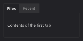
void r_tabs(r_ui_list* l, rect r, char** labels, int count, r_data_binding selected, r_ui_list** pages);
A tab bar with count tabs and a page for each. pages receives one viewport per tab, build each page into its document_area. Only the selected page is visible, switching tabs doesn't need a rebuild.
static int tab = 0; // [...] static char* labels[] = { "Files", "Recent" }; r_ui_list* pages[2]; r_tabs(ui, r_shrink(ui->root_area, 12), labels, 2, R_PTR(&tab), pages); r_label(pages[0], r_shrink(pages[0]->document_area, 8), "Contents of the first tab"); r_label(pages[1], r_shrink(pages[1]->document_area, 8), "Contents of the second tab");

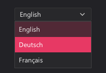
void r_dropdown(r_ui_list* l, rect r, char** items, int count, r_data_binding selected);
A button showing the selected entry of items, clicking it opens a popup to choose another. selected is bound to the index. Arrow keys change the selection while focused.
static int language = 0; // [...] static char* languages[] = { "English", "Deutsch", "Français" }; rect r = r_aligned(R_TOP, r_shrink(ui->root_area, 16), (rect){ .w = 160, .h = 28 }); r_dropdown(ui, r, languages, 3, R_PTR(&language));

void r_segmented(r_ui_list* l, rect r, char** labels, int count, r_data_binding selected);
A row of joined buttons sharing the width evenly, one of them selected. selected is bound to the index.
static int period = 1; // [...] static char* periods[] = { "Day", "Week", "Month" }; rect r = r_aligned(R_CENTER, ui->root_area, (rect){ .w = 220, .h = 28 }); r_segmented(ui, r, periods, 3, R_PTR(&period));

Concepts: binding
bool r_tree_node(r_ui_list* l, rect r, int depth, const char* text, int icon, bool has_children, r_data_binding open, int64_t value, r_data_binding selected);
One row of a tree view. depth indents the row, has_children adds an arrow toggling the open binding, double clicking the row does the same. Like r_selectable the row is selected while selected equals value. Returns true if the node has children and is open, so children are only built when visible. Use r_next_keyed to keep IDs stable when nodes open or close.
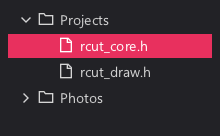
static int selected = 1; static bool tree_open[4] = { true }; // [...] r_layout_iter it = r_stack(ui, r_shrink(ui->root_area, 8), R_TOP); it.spacing = 2; if(r_tree_node(ui, r_next_keyed(&it, 24, 0), 0, "Projects", R_ICON_FOLDER, true, R_PTR(&tree_open[0]), 0, R_PTR(&selected))) { r_tree_node(ui, r_next_keyed(&it, 24, 1), 1, "rcut_core.h", R_ICON_FILE, false, R_PTR(&tree_open[1]), 1, R_PTR(&selected)); r_tree_node(ui, r_next_keyed(&it, 24, 2), 1, "rcut_draw.h", R_ICON_FILE, false, R_PTR(&tree_open[2]), 2, R_PTR(&selected)); } r_tree_node(ui, r_next_keyed(&it, 24, 3), 0, "Photos", R_ICON_FOLDER, true, R_PTR(&tree_open[3]), 3, R_PTR(&selected));

Concepts: binding
void r_split(r_ui_list* l, rect r, r_alignment dir, r_data_binding fraction, int min_first, int min_second, rect* first, rect* second);
Splits r into first and second with a draggable separator in between, side by side for R_LEFT/R_RIGHT, stacked otherwise. fraction is bound to the size of first relative to the whole, min_first and min_second are minimum sizes in pixels.
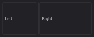
static float split = 0.4f; // [...] rect left, right; r_split(ui, r_shrink(ui->root_area, 8), R_LEFT, R_PTR(&split), 60, 60, &left, &right); r_panel(ui, left, 0); r_panel(ui, right, 0); r_label(ui, r_shrink(left, 8), "Left"); r_label(ui, r_shrink(right, 8), "Right");

void r_line_edit(r_ui_list* l, rect r, char* buffer, int capacity, const char* placeholder); void r_line_edit_on_submit(r_ui_list* l, rect r, void (*on_submit)(char* buffer));
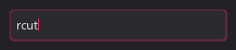
A single line text input editing buffer in place, capacity being the buffer size including the terminator. placeholder is shown while empty. Supports selection, clipboard and IME input. r_line_edit_on_submit sets a function called on Enter.
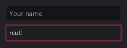
static char name[64] = ""; static char search[64] = "rcut"; // [...] r_layout_iter it = r_stack(ui, r_shrink(ui->root_area, 12), R_TOP); r_line_edit(ui, r_next(&it, -1), name, sizeof(name), "Your name"); r_line_edit(ui, r_next(&it, -1), search, sizeof(search), "Search");

Concepts: drawable, interactable
void r_text_area(r_ui_list* l, rect r, char* buffer, int capacity, const char* placeholder);
Like r_line_edit, but multiline: Enter inserts a newline and the content scrolls vertically.
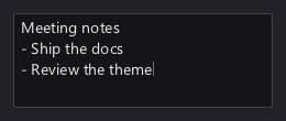
static char notes[256] = "Meeting notes\n- Ship the docs\n- Review the theme"; // [...] r_text_area(ui, r_shrink(ui->root_area, 12), notes, sizeof(notes), "Write something...");

Concepts: drawable, interactable
void r_text_edit_ex(r_ui_list* l, rect r, char* buffer, int capacity, const char* placeholder, int style, bool multiline);
The text input behind r_line_edit and r_text_area, with a custom style and the multiline switch.
static char search[64] = "rcut"; // [...] r_layout_iter it = r_stack(ui, r_shrink(ui->root_area, 12), R_TOP); r_text_edit_ex(ui, r_next(&it, -1), search, sizeof(search), "Search", R_STYLE_INPUT | R_VARIANT_FLAT, false);

Concepts: drawable
typedef struct r_text_edit_state r_text_edit_state;
Caret, selection and scroll position of a text input. Stored as callback data, so it survives rebuilds as long as the input's rect keeps its ID.
void r_tooltip(r_ui_list* l, rect r, const char* text);
Shows text (at most 511 bytes) in a tooltip while the mouse hovers r.
rect ok = r_aligned(R_CENTER, ui->root_area, (rect){ .w = 100, .h = 32 }); r_button(ui, ok, "OK"); r_tooltip(ui, ok, "Applies the settings and closes the window.");
See also: r_popup, RCUT_MOUSE_*
Concepts: ephemeral
rect r_dialog_begin(r_ui_list* dialog);
Clears the dialog list, draws its background and returns the content area inside the padding. Call it first when building a dialog.
static char name[64] = ""; // [...] r_ui_list* dialog = r_sdl_dialog(f, 300, 320, 140, "Settings"); rect area = r_dialog_begin(dialog); r_layout_iter it = r_stack(dialog, area, R_TOP); r_label(dialog, r_next(&it, 20), "Display name"); r_line_edit(dialog, r_next(&it, -1), name, sizeof(name), "Your name");
Concepts: ui_list
typedef enum r_icon_variant{ R_ICON_NONE, R_ICON_DROPDOWN_INDICATOR, R_ICON_UP, R_ICON_DOWN, R_ICON_LEFT, R_ICON_RIGHT, R_ICON_BACK, // <- R_ICON_MORE, // ... R_ICON_EXPANDED, // [-] R_ICON_COLLAPSED, // [+] R_ICON_SHOW_DETAILS, // > R_ICON_HIDE_DETAILS, // ▼ R_ICON_ADD, // + R_ICON_SUBTRACT, // - R_ICON_EDIT, R_ICON_SEARCH, R_ICON_RELOAD, R_ICON_ZOOM_IN, R_ICON_ZOOM_OUT, R_ICON_ROTATE_LEFT, R_ICON_ROTATE_RIGHT, R_ICON_LOCK, R_ICON_UNLOCK, R_ICON_CHECKED, R_ICON_UNCHECKED, R_ICON_MARKED, R_ICON_INFO, // (?) R_ICON_WARNING, // (!) R_ICON_ERROR, // (x) R_ICON_MINIMIZE, // _ R_ICON_MAXIMIZE, R_ICON_UNMAXIMIZE, R_ICON_CLOSE, // x R_ICON_MENU, // Hamburger R_ICON_SETTINGS, R_ICON_HOME, R_ICON_FOLDER, R_ICON_FILE, R_ICON_SAVE, R_ICON_TRASH, R_ICON_COPY, R_ICON_CUT, R_ICON_PASTE, R_ICON_UNDO, R_ICON_REDO, R_ICON_STAR, R_ICON_HEART, R_ICON_BELL, R_ICON_PLAY, R_ICON_PAUSE, R_ICON_EYE, R_ICON_PERSON, R_ICON_USER } r_icon_variant;
Built-in icons for r_icon and the icon arguments of widgets. They are drawn by the theme and match the rest of the UI.